Python Plotting Libraries
Sun Jan 20 2019
TLDR: Use matplotlib for speed if you’re just doing a quick analysis for yourself. If you’re sharing the plots, plotly is definitely worth checking out.
I’ve used matplotlib for a while and it’s awesome - simple API, lots of plotting options. The defaults can be a little ugly, but seaborn can very easily make them all much nicer. However, the graphs generated are pngs/svgs, so don’t scale that easily and miss out on some cool interactive features of other libraries.
Bokeh and Plotly are two good alternatives. Both are open source, though plotly has a for profit branch linked to Dash, a framework for building analytical webapps. You don’t need to use it, but default/examples on their docs often do.
Here I want to compare the 3 on ease of use, functionality and aesthetics.
Installation
Plotly and Matplotlib are very easy with pip or conda (conda install plotly/matplotlib). Bokeh also works via pip or seaborn, but if you want it to work with JupyterLab, you’ll need an extension: jupyter labextension install jupyterlab_bokeh.
Basic examples: Line Plot
These are deliberately very bare bones and are just examples of plots I do most frequently. All of the frameworks are super customisable, but if you’re running a quick analysis you often just want the core features, so I’m not generally bothering with axis labels and legends.
Data
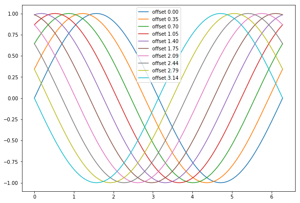
Generate some nice offset sine waves and a legend.
import numpy as np

# Linearly spaced, 0 - 2 * pi
x = np.linspace(0, np.pi*2, 1000)

data = [('offset %1.2f' % i, np.sin(x+i)) for i in np.linspace(0, np.pi, 10)]
legend, ys = zip(*data)
Matplotlib
%matplotlib inline
# The first line above needs to be called once to make outputs appear inline in jupyter

import matplotlib.pyplot as plt

# I lied: this is a litte formatting to make the default size comparable to the others.
plt.figure(figsize=(10, 7))


for y in ys:
    plt.plot(x, y)
_ = plt.legend(legend)
Plotly
A little bit more boilerplate. We need to generate a bunch of ‘traces’, which are basically just dictionaries, and then hand them to the plotting function.
import plotly.graph_objs as go
import plotly.offline as py

traces = []

for leg, y in zip(legend, ys):
    traces.append(go.Scatter(x=x, y=y, name=leg))

py.iplot(traces)
Bokeh
Note that we have to set output_notebook to plot inside the notebook. The alternative is output_file('filename.html').
from bokeh.plotting import figure, output_notebook, show

output_notebook()

p = figure()

for leg, y in zip(legend, ys):
    p.line(x, y, legend=leg)

show(p)
Interim conclusion
I love the conciseness of the matplotlib API, the others feel clunky to me in comparsion. But maybe that’s just what I’m used to. The interactivity and aesthetics of the others are definitely better though.
Basic examples: histogram
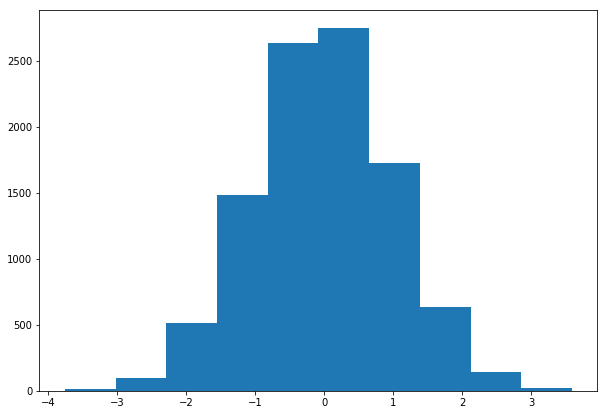
I made scatter plots, they work similarly to the line plots and aren’t that interesting to show. Perhaps a more interesting example is something more complex that I also use quite a lot - a histogram of the data to get an idea of its distribution.
The data, random and normally distributed.
x = np.random.normal(size=10000)Matplotlib
It doesn’t get much more concise than this.
plt.hist(x)
Plotly
Also pretty terse.
traces = [go.Histogram(x=x)]

py.plot(traces)
Bokeh
By far the most complex as this isn’t built in, so we’re basically just making a bar plot (not sure why this is called ‘quad’ here). This is adapted from their docs here.
# Get the bins for the histogram
hist, edges = np.histogram(x, density=True, bins=100)
xx = np.linspace(-2, 2, 1000)

p = figure()
p.quad(top=hist, bottom=0, left=edges[:-1], right=edges[1:])
show(p)
Misc
- Something kept crashing my jupyter notebook page after some time had gone by since plotting. It looks like the culprit was Bokeh, but it was a little hard to reproduce.
- Both Bokeh and Plotly get a fair bit slower if you have loads of data. e.g. measuring time to render with a stopwatch (
%timeitmagic wont measure frontend stuff) and changing the line plot to show 100 examples took:- 2.6s with matplotlib
- 9.2s with plotly
- 7.8s with bokeh.
Winners
Ease of use: matplotlib
For basic things mpl had the least lines of code and was most intuitive off the bat. Plotly would follow as it has more tools included.
Interactivity: bokeh
Both are nice, if a little slow sometimes. This was worse in jupyter than on this site. I slightly prefer the lack of hover info by default in bokeh, and also click to drag just feels more natural as the default setting. Not much in it though. Apparently it is possible to get interactive plots inside jupyter with matplotlib, but I’ve found it a hassle to setup and slightly unreliable.
Aesthetics: plotly
Lovely looking plots as default. Personal preference, but a clear winner for me.
Conclusion
For client-facing tasks, I’ll use plotly in the future. For generating quick plots to examine data for my own sake, I’ll stick with matplotlib as it’s much faster, both in terms of time to render and in terms of using the API. I sometimes use matplotlib with seaborn to make it prettier to show people internally if I’m feeling fancy.
It’s a little rough, but you can see the Jupyter Notebook I based this on here.